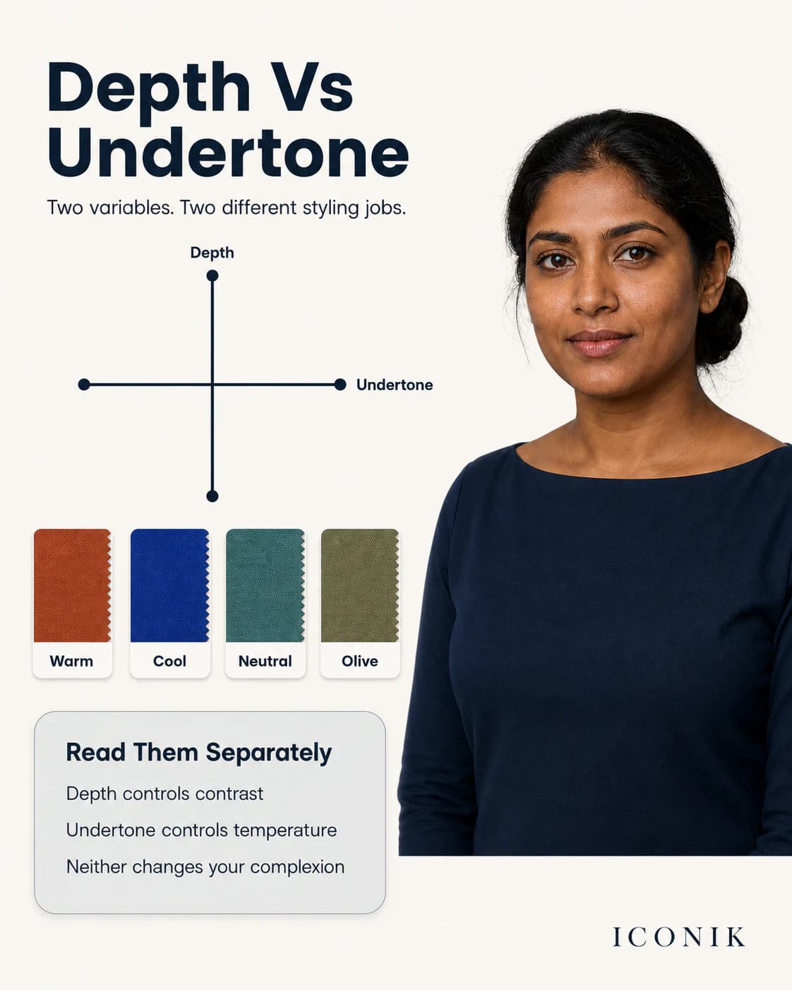
Use four variables—not one skin-tone label
1. Skin depth
Depth describes how light or deep the visible complexion appears. Terms such as fair, wheatish, dusky and deep are subjective social descriptions, not complete palette categories.
2. Undertone direction
Warm, cool, neutral and olive describe colour behaviour observed through comparison. Every direction can appear at every depth.
3. Clarity
Some faces remain defined beside vivid colour; others look more coherent beside softened, greyed or complex shades. This is independent of simply being warm or cool.
4. Contrast
Contrast compares light and dark across skin, hair, eyes and the outfit. It helps decide whether stark black-and-white, tonal dressing or a medium contrast feels most intentional.
Three shortcuts that produce weak advice
“Brown skin is warm”
Brown skin can lean warm, cool, neutral or olive. A golden surface cast can also coexist with cooler colour behaviour. Test fabric rather than assuming.
“Dark hair means Autumn or Winter”
Dark hair is common across South Asia, so it cannot do most of the classification work. Undertone, clarity and overall contrast still need to be observed.
“Deeper skin needs only jewel tones”
Jewel tones can create useful saturation and contrast, but deeper skin can also wear pastels, earth tones and neutrals. The exact tint, fabric finish and surrounding contrast decide the outcome.
What changes as skin depth changes?
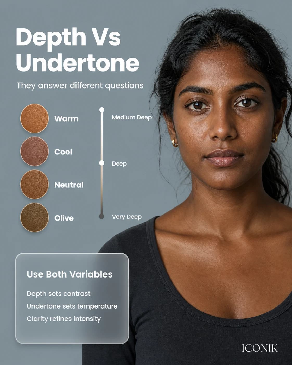
Depth does not dictate temperature, but it can change how much white, grey or saturation a fabric can carry before it appears chalky, dull or overpowering.
- Lighter depth: test whether pale colours need softness or a deeper anchor to preserve facial definition.
- Medium or wheatish depth: compare temperature first, then check olive and clarity because surface gold can hide mixed results.
- Dusky or medium-deep depth: test clear and muted versions; avoid assuming all pastels will wash the face out.
- Deep depth: compare the amount of white in a tint and the outfit's total contrast. Rich colour is an option, not an obligation.
Translate the palette into Indian garments
A palette is only valuable when it answers real purchase and outfit questions:
- Saree: test the blouse and pallu nearest the face; the saree body can be more flexible.
- Kurta set: place the supportive colour in the kurta or dupatta and repeat one neutral below.
- Lehenga: evaluate blouse, dupatta, zari and stones together because reflected light changes the neckline effect.
- Office wear: choose two repeatable neutrals before adding statement colours.
- Jewellery: compare metal finish, scale and stones with the neckline colour rather than selecting metal from skin depth alone.
For controlled comparisons, follow the at-home undertone guide.
What ICONIK adapts in Chromatic Harmony Mapping™
ICONIK's proprietary framework records undertone direction, skin depth, clarity, contrast and wardrobe context. It then turns those observations into a limited set of reference colours, useful neutrals and outfit applications.
It is a styling framework, not a physiological assessment or a scientifically validated diagnostic system. The reader's preferences, culture, dress code and the exact fabric can override the framework. Read the canonical methodology page for its process and limitations.