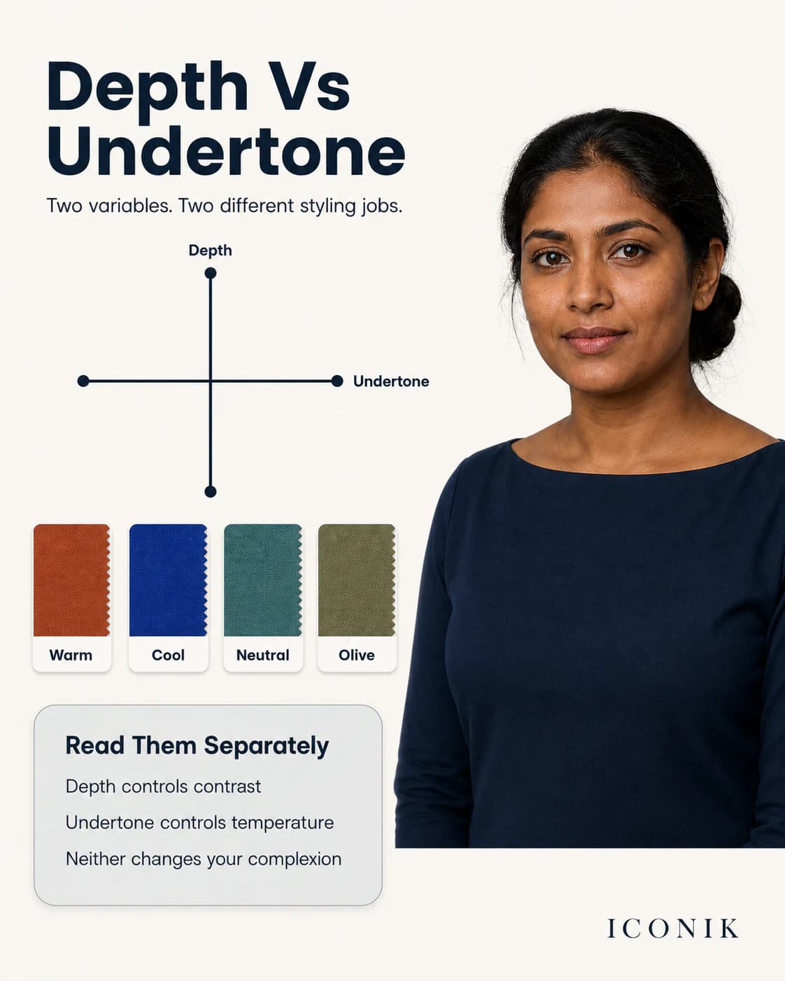
What undertone does—and does not—mean
In personal styling, undertone is shorthand for the colour temperature that appears most harmonious near the face: broadly warm, cool or balanced. It is not the same as visible skin depth. Two people described as fair, wheatish, dusky or deep can respond differently to the same fabric.
Undertone is also not a health reading or a permanent wardrobe law. Tanning, redness, hyperpigmentation, makeup, lighting and camera processing can alter what you see. That is why the useful question is not simply “What am I?” but “Which repeated colour relationships make my face look clearer and more even under controlled conditions?”
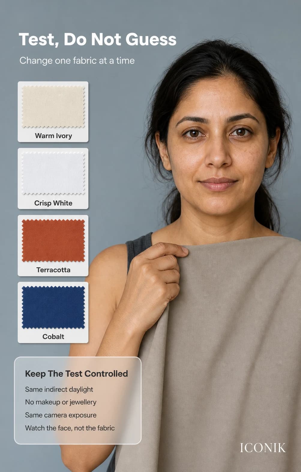
The controlled fabric-drape test
- Set the light. Stand in indirect daylight. Turn off yellow, coloured or fluorescent indoor lights.
- Reduce competing colour. Remove dominant lipstick, tinted foundation, large earrings and bright clothing near the face.
- Fix the comparison. Keep your face, camera position and exposure unchanged. A mirror is better than an auto-adjusting phone if the phone changes brightness.
- Test light neutrals. Compare warm ivory with crisp white.
- Test temperature. Compare similarly deep fabrics such as terracotta and cobalt, or olive and cool emerald.
- Repeat. Re-test the clearest pair in similar light on another day before deciding.
Use actual garments or opaque fabrics when possible. A small digital swatch on a bright phone screen does not reflect light onto the face in the same way.
How to read the face, not the colour name
For each drape, look for several signals together:
- Are the eyes and lips easy to see, or does the fabric become the only thing you notice?
- Do under-eye shadows appear stronger or softer?
- Does the skin pick up an unwanted yellow, grey, red or green cast?
- Does facial definition improve without requiring more makeup?
- Would the effect still suit the outfit context you are dressing for?
One signal is not enough. A very bright cool blue may sharpen the eyes but overpower the face; a softer blue may keep the cool direction without the intensity. That means clarity, not temperature, was the second variable to adjust.
Why vein, paper and jewellery tests often conflict
Vein colour
Veins sit below skin and can appear blue, green or indistinct depending on skin depth, vein depth and lighting. They do not directly test how clothing reflects colour onto the face.
White paper
Paper can reveal a cast, but its own brightness and the surrounding room affect the comparison. Use white versus ivory fabric instead, because that is a real wardrobe choice.
Gold versus silver
Metal finish, shine, scale and stones influence the result. Compare pieces of similar size and finish, then judge them with the neckline colours you actually wear.
Turn the observation into outfits
Start with three categories instead of a long prohibited-colour list:
- One useful light: crisp white, soft white or warm ivory.
- Two reliable neutrals: for trousers, jackets, bags and repeat wear.
- Three face colours: for kurtas, blouses, shirts, dupattas and saree pallus.
Keep colours you love. If one is difficult near the face, move it to a lower garment, border, bag or shoe, or separate it from the face with a more supportive neckline colour. Continue with the complete colour-analysis guide or try the free Glow Test.